Archive for the ‘Reviews’ Category

MapQuest: Free talking turn-by-turn directions for your iPhone

If you’re an iPhone user with friends on Android devices, you’ve probably seen their super-slick google maps with turn-by-turn directions.  Since the google maps app on iPhone will probably *NEVER* get updated to work the same as it does on android for obvious reasons, you have to look elsewhere for turn-by-turn directions.

I’ve gone down this road in the past, and not found anything free worth using in the app store, but that changed recently.

Remember MapQuest?. .  . you know, that site you went to for directions online before google maps existed?  Well, MapQuest has an iPhone app out called “MapQuest 4 Mobile”.  It’s 100% free, gives turn-by-turn directions both on screen and via voice, and recalculates when you miss a turn.

I tried it on my way home a few days ago, and it worked perfectly.  It *does* like to eat the battery, as any GPS app does.  I left work with ~45% battery, and got home with ~30%.   My drive is 35 miles and usually takes just under an hour, so 15% loss isn’t terrible I suppose.

If you have an iPhone, I strongly suggest you give it a try.

Get it here:

http://itunes.apple.com/us/app/mapquest-4-mobile/id316126557?mt=8&ls=1

Review: HP TouchPad – First Thoughts

Persistence paid off, and I was finally able to get an HP TouchPad at the unbelievable price of $99.99.

I got to use it for about an hour last night, so this review is truly first thoughts from a tech geek that swapped his iPad 2 for an HP TouchPad for one night.

The model I’m reviewing here is the 16GB WiFi.

Packaging: I’m only mentioning it, because it was impressive. I’d say it was on par with the quality of the iPad packaging.  An inner box slides out of an outer shell, and the TouchPad is well cushioned and separated from the accessories.  The accessories are under a flap, and also divided from each other.

Accessories: You get a USB cable and a power adapter.  The power adapter is big. . in fact, it’s a bigger then the old-style plastic 35-mm film canisters, and the same shape.  The outlet prongs fold into the cylinder, but it’s still BIG.  If you’re packing light, it’ll be frustrating that the adapter is this big.

The actual quality of both is nice, and it seems like they went out of their way to ensure this.  I bet someone in mgmt said, “OMG, we have to justify the cost of this mediocore product, make everything it comes with look like Bentley made it”.

Device: The TouchPad itself, in my opinion, is of a lower quality than both the iPad 1 and 2.  The chassis is plastic, and the buttons are “ok”.  It’s very similar to the design of the iPhone 3G, which, in my opinion, is also of inferior quality compared to the iPhone 2.5G, iPhone 4, iPad, and iPad 2.   I’ve heard rumors folks are having issues with cracking around the speakers and bottom port, and I believe it.  The design and build quality doesn’t instill the same confidence I have in other portable electronics.  That said, compared to Chinese import cheapo tablets in the $90 – $200 range, this thing is tank.

The screen is gorgeous.  No flaws here whatsoever in my limited play session.  Color rendition is good, brightness is good, viewing angle is good.  Job well done here.  The speakers are also pretty good.  I fired up Pandora and had no complaints.  I think the “beats” name is a bit of a stretch here, and I wonder how much better it could have sounded if they spent the money on the speakers instead of the licensing.  Regardless, it’s better than expected for the size of the device, and loud enough for quiet to moderately noisy environments if it’s right in front of you.

OS/Interface: Wow, such mixed feelings here. . .   I love the way multitasking is handled, and I love that it handles flash, but it feels sluggish and scrolling often pauses or stutters.  Speaking of flash, it did leave me thinking, “wtf Apple, just gimme Flash already”.  99% of the flash I  surfed to worked just fine and didn’t bog the device any more than other pages.  C’mon Apple, make it happen :)

Settings, App mgmt, and customization are all poorly implemented.  To be fair, some of the settings are easily adjusted, but most are buried intuitively leaving you feeling like you’re running Windows 3.11 all over again.  Seriously HP, is this the best you could do?

Media: This was a big fail for me.  Admittedly I spent very little time with it, but I copied an H.264 movie to it that I’ve successfully watched on my iPhone, iPad, Samsung Smart TV, Windows Media Center, VLC, etc., and the TouchPad choked.  I’m sure if I re-encoded it, it’d be fine, but that’s a real pain in the ass if you just want to get some movies on there for the kids before running out the door.  I hear there’s an app that’s a lot more flexible around media types, but I wasn’t dropping any coin on apps with Android on the horizon.

Final Thoughts: This thing is a STEAL at $99.99.  If you see one, buy it.  The original price tag was not realistic, not with the current polish of this device.  The most I would have paid if I was in the market for another tablet and it wasn’t fire-sale’d is probably about $250.  That’ll change if cyanogen is successful with their Android port.  It easily adds another $50 to $100 to what I’d pay, and I’ve got my fingers crossed I’m reviewing this same tablet again in a month or two with Android on it, much more favorably.

Review: Top Gear US – Season 2, Episode 1

Top Gear US is back for season 2, and unfortunately, it still “stinks”.

Episode 1 was entirely taken up by a challenge:

Each host was to buy a “car”  to replace the staple Texas pickup, and then compete in various challenges around the state.

Those that follow Top Gear UK know that the challenge episodes are some of the best.  In fact, I’ve seen several of them several times like the Bolivia special, the Polar challenge, etc.

This US challenge just didn’t stack up.  The chemistry between the hosts just isn’t there, and it shows even more in a challenge episode where all 3 are front and center the whole time.  Tanner is probably the best, followed by Rutledge and Adam just doesn’t fit.  It’s not that the antics and style Adam brings to the show are wrong, he’s just the wrong person to do it.  99% of the time he’s downright annoying, but I’ll admit the 1% of the time I do laugh, it’s hearty.

The challenge builds up through some cattle herding where somehow we’re expected to believe Tanner fixes a fuel line with some tape, a manure-hauling contest, and finally ends in a “monster-truck”  race where they face off on a course full of jumps and banked dirt turns in their cars after a few modifications.  The modifications look like they just sat each car atop a toyota truck chassis (90’s era?) and called it a day.   Adam’s car catches fire, and Tanner cleans up on Rutledge after he loses a wheel.  Whatever. . ZZZZzzzzzzzzzz

I’ll admit I’m a hardcore fan of the UK series, and their chemistry is established over MANY SEASONS, but the US show needs help to succeed.

C’mon History Channel, get it right.  I REALLY want to like this show.

3M-50 Wi-FI Thermostat: UPDATE

Original post here:

http://moderntoil.com/?p=325

Click HERE for the CT50, and HERE for the CT80.

This arrived last week, and it’s everything I hoped for, plus more.  VERY programmable via back-end JSON interface.  Of course, I’m old-skool and stubborn so I wrote a whole web-app in bash to control it :)

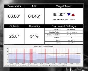
Here’s what my interface looks like:

Click it for a full size version.

The outside temp/humidity is polled via weather underground (XML feed), and the graph is gen’d by cacti.  I already use cacti for tons of other stuff, so it was only natural to use it for data collection here.   The red vertical on the graph represents the periods my furnace runs.  The rest of the legend it pretty obvious if you look at the full size snap.

If you’re even remotely THINKING of getting an ip-enabled thermostat, get one of these, they rock.

For those that don’t want to write their own app to control it, it can communicate directly to radio thermostat’s website and you can control it from there.  I just don’t like the idea of my thermostat taking orders from someplace else, so I wrote my own :)

There’s good documentation of the API here:

http://central.isaroach.com/wiki/index.php/Main_Page

iPhone 4: pure, industrial class for your pocket

I followed the Apple WWDC 2010 loosely via a liveblog since I was at work during the event, but since then I’ve been closely following the reviews and reports on the iPhone 4. I’m impressed, REAL impressed.

Specs avail from apple here:

http://www.apple.com/iphone/specs.html

but, let me break down what matters most to me:

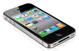
1) Class. The thing is fucking gorgeous. . . . I’m a huge sucker for industrialesque design where form follows function, and the iPhone 4 does this in a way that just shuts the door on other smart phones out there, including their own 3G and 3GS iPhones. The “original iPhone” with it’s metal back, and game-changing all glass front is a close second to this, and I’m SOOOO glad they’ve gone back to this type of design. The metal sides on the iPhone 4 are actually antennas, and the front and rear are a special engineered glass that’s stronger and more durable than anything found on a smartphone before.

2) 720p 30fps HD video. Damn straight, HD video onboard. Quit shopping for a newer video cam to replace your aging Hi8 or miniDV behemoth you currently haul to “events”, because the iPhone 4 just obsoleted them. It’s not that there aren’t dedicated cameras out there that will do a better job than this one, there are. But, this one will do a better job than what 99% of people already own for a video cam, and it’ll always be at the ready, in your pocket. I won’t even talk about the convenience of quick edits and youtube/email straight from the phone. It’s a given.

3) 960×640 display. Apple calls it a “retina display” which I’ve never heard of, so their marketing dept. probably invented it. Regardless, that’s a HUGE amount of pixels for such a tiny screen. Reviewers are saying even at a distance from their eye of only a few inches, they can’t make out the pixels in the image. I’m sold, porn will no doubt look amazing :P

4) Front-facing 2nd camera. To be honest, it’s about time the iPhone gets this. Ever since the original iPhone came out in 2007, people have had half-baked ideas about some crazy mirror to use the rear cam for video calls as the iPhone seems otherwise so well fit for this type of use scenario. Now folks can quit pretending to be inventors, and just go buy the new iPhone. Apple didn’t talk about supporting anything other than “FaceTime”, but Jobs did promise to make it an open standard, and with the app store, I’m sure the front cam will have 5000 uses a week after launch date. Chatroullette anyone?

5) Maximum operating altitude: 10,000 feet. Just kidding, wanted to see if anyone was even still reading :)

Bottom line, it’s available June 15th, and you’ll find me hitting refresh on the order page starting at 11:55pm on the 14th.